Why Your Landing Page Color Scheme is More Important Than You Think
When you think about getting landing pages to convert, what comes to mind? A good design? Copy that grabs attention? A big, bold CTA button?
While those things are all important factors to improving conversion rates, there’s one aspect of your site you may be overlooking, and it could be costing you customers.
We’re talking about color.
Surprised? Don’t be. Improving conversions is all about persuasion. You have to convince visitors to become customers based on only a few elements of your site. The problem with our modern persuasion tactics, however, is that we often focus too much on numbers and statistics and forget that we’re trying to sway real-life human beings. As it turns out, one of the biggest influencers for human decision-making is color.
In fact, there’s an entire branch of psychology dedicated to finding out how color affects human behavior (it’s called color psychology), and studies show that when it comes to converting customers, visuals matter.
In a peer-reviewed study, Dr. Satyendra Singh discovered that it takes a mere 90 seconds for customers to form an opinion of a product and that 62-90% of that interaction is determined by the color of the product alone.
So what does this mean for you? It means that if you’re looking to boost your conversion rates, your color scheme matters.
Here’s what you need to know…
Choose Colors by Target Market
The human brain is designed to be a visual processor. It can digest visual information 60,000 times faster than plain text. This means that the colors you use on your landing pages will be instantly processed by your visitors, so knowing which colors will win them over is important.
But there are several ways you can go about choosing the most affective colors for your site. The first way is by assessing your target market, because different people process colors different ways.
Women Prefer…
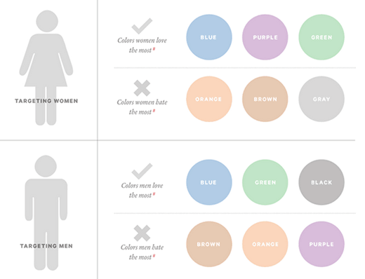
In a survey on color and gender, 35% of women said blue was their favorite color, while 33% said orange was their least favorite color. If your target market is primarily women, stick with tints of blue, purple, and green, and avoid earthy tones like gray, brown, and orange.
Men Prefer…
If your target market is primarily men, you should use bold colors like red, blue, greens, and even black (it turns out you still want to avoid earthy tones, though). Use deeper and bolder shades of these colors, as they’re traditionally associated with masculinity (and avoid lighter “feminine” tints).

If your market is mixed, however, don’t worry. Both men and women are shown to like popular colors in neutral shades, like blue or green. If you have a mixed market you can also choose colors based on nationality instead of gender, too.
International Markets Prefer…
If your company targets an international audience, be sure you understand how color is viewed in other nations. Americans tend to favor the color blue, for example, while Scandinavian countries prefer multi-colors.
In countries like China, for example, white is used for solemn occasions like funerals, so it isn’t associated with the same “happy” emotions (weddings, purity, etc.) that Americans attach to it, while bold colors like red or yellow are highly favored. Americans love blue for its sense of strength and security, but in some countries it’s symbolic of loneliness and sadness.
If you’re still not sure about choosing a color scheme based on your target market (or your market is too broad or convoluted), you can always choose colors based on your company’s personal branding instead.
Choose Colors by Brand Identity
Branding is an important part to any company, and because certain colors convey certain emotions, you want to make sure that your color choices reflect positive emotions for your business.
Red Conveys…
Red conveys a sense of excitement and boldness and is commonly used to advertise sales. It also ignites ideas of passion and hunger, so if you’re looking for immediate action (like a CTA button or a flash sale), use red.
Orange Conveys…
While not the most popular color, orange still has its place on your landing page if you want to communicate friendliness, fun, and confidence, which is why it’s often used for sports and children’s products. It can be used as an accent, or, if you’re an e-commerce site (think Amazon.com), you can use orange to encourage sales during the checkout process.
Yellow Conveys…
Yellow, arguably the happiest of all colors, reflects optimism, warmth, and happiness. If you want to communicate that your business is family-friendly, go with yellow shades. Oppositely, it’s also the color for warning. If you have elements of your site that need to be read right away, use a yellow accent color. Just make sure you don’t use it as a font color, as it can be hard to read if there’s not enough contrast.
Green Conveys…
Green is the color of tranquility, peacefulness, and nature. If you want customers to know that you’re eco-friendly and low maintenance, using green is a great way to do that. It’s also the perfect color for creative industries (graphic design, web development, arts, etc.) as one study indicates that when presented with flashes of green, people had more bursts of creativity than when shown any other color.
Blue Conveys…
Blue is one of the most loved and most used colors, which can be either good or bad depending on your goals. Blue conveys a sense of security, trust, and connection, which is why sites like Facebook use blue (and most of corporate America). But using blue can also mean you’re just like everyone else, so pairing it with less-used accent colors (like orange or yellow) can help differentiate you from your competition.
Purple Conveys…
Purple, like green, is the color of creativity, but it also conveys a sense of sophistication and wisdom, as it’s often associated with royalty. This is one of those colors that work well with luxury goods and services. It’s also heavily associated with femininity, especially in America, so if your target audience skews toward women, this is a great choice.
Black Conveys…
While black may or may not be an actual color, it is a standard for most text. But it can also be used as a deluxe tone. According to an article from Lifescript, black conveys elegance, sophistication, and power, and is considered timeless and classic. Black can also be used to communicate exclusivity and has an added sense of value.
White Conveys…
White can mean different things to different people, but its primary function when it comes to design is actually to help offset other visuals. It may not have inherent meaning beyond “clean” or “professional,” it’s still a valuable color (or non-color, depending on who you ask).

Source: Neil Patel
Choose Colors Strategically
If you’re still not sure which colors will help you reach maximum conversions, consider the following:
First impressions matter. You only get one chance (90 seconds!) to reach your audience with colors, so if you can’t decide between a bold red or a soft yellow, go for whichever will make the most initial impact. Just remember that you want to make a good impression on first-time visitors without alienating your returning customers, so use bold accents with white space to offset other elements. Keep your look clean, but attention-grabbing.
Use bright colors where action is needed. If color choice makes you panic because your current site feels boring (let’s say you used too many earth tones), don’t worry. Using color strategically is about finding areas that need to stand out. Use bright, bold colors like red, yellow, and orange on your CTA buttons, pop-up buttons, or as visual indicators of action steps (like arrows pointing on something to click). You can keep the rest of your page muted if you have standout colors in key areas to make up the difference.
Contrast your colors for legibility. As mentioned earlier, if you’re using bold colors like yellow or orange for your text, don’t put them on equally bright and bold backgrounds. If your text is muted, like gray or brown, make sure the colors are deep enough so they don’t fade into a white background. If you make content difficult to read, you won’t be converting anyone.