How To Make Users Want to Fill In Your Forms
Online forms are a digital marketing gateway. They’re the filter between the people who are merely interested in your content, product, or service, and the people who will become paying customers. But when it comes to your forms, do your potential customers actually want to fill them in?
Forms can either ease the transition between “merely interested” to “paying customer,” or they can frighten away potential business. Here are a few ways you can optimize your online forms so that users will actually want to fill them in.
Entice users with great content
You can spend hours designing beautiful forms for your website, but if potential customers don’t believe that the form will lead to something significant, they won’t bother filling them in.
After all, there’s no point in using forms to generate leads if those leads don’t turn into paid business.
Unless your content adds value, your form is essentially worthless.
The best way to ensure that users will fill in your forms is to give them something worthwhile on the other side. By optimizing your content, you can entice potential customers to click “submit.”
Offer valuable content
Whether you’re trying to acquire sales leads by gathering basic contact information, capture a customer’s feedback, or simply attempting to get more subscribers to your newsletter, you’ll need to grab their attention with your content first.
One of the best ways to garner form submissions is by having information on an optimized landing page alongside your form that includes details about what’s in it for the customer.
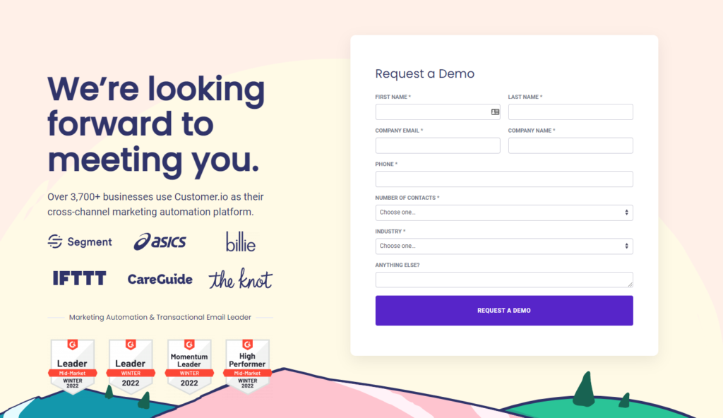
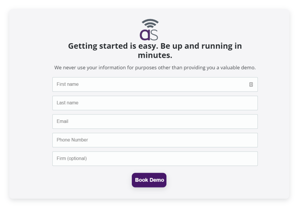
Including things like attention-grabbing headlines, bullet points that highlight benefits, content previews, and calls-to-action will create curiosity and make potential customers want to know more. You can also include text in your forms that mimics the language in the landing page, helping to create a natural flow between reading and submitting.
Another great way to gather submissions is to include a short call-to-action at the end of your content preview with a promise of more (and equally beneficial) content. This technique works especially well if your content or service is intriguing and fills a knowledge gap or need from the customer’s perspective.
It should be noted, however, that this only works if your content is meaningful to the customer. If what you have to offer isn’t worth the time it takes to submit the form, having forms may actually turn away further business. By ensuring that your content is genuinely beneficial, you can eliminate any hesitations and capture customer data.
Utilize your microcopy
Another important and often overlooked feature of any successful form is the language that’s used to guide people while they’re filling it in. Microcopy, or the small bits of text that instruct users or address concerns, plays a crucial role not only in getting users to fill in the form, but helping prevent errors that slow down the process.
A discussion on using microcopy to minimize errors on your forms points out that sometimes microcopies don’t give clear enough instructions, and may have a huge influence on how users fill your forms. Even the smallest copy can matter in an interface; for example, transactions can fail because the address people were entering [on the forms] didn’t match the one on their cards, which is why it's helpful to add a little text to remind them which field they're filling in.
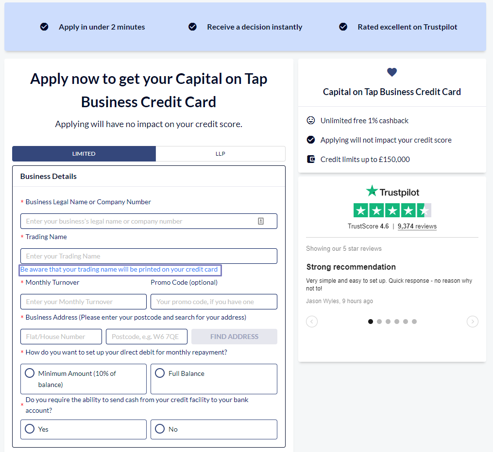
You can make a quick change on the microcopies on your forms to notify users to enter the address information associated with their credit card (instead of a general address) and errors can stopped. In light of this lesson, designers are encouraged to add microcopy to all areas of their forms, including notifying customers that they can unsubscribe from a newsletter at any time, or that their email won’t be spammed when they sign up.
It can also help to add more natural language styles throughout your forms and in your call-to-action buttons that promote the benefits of your content. Using copy such as, “Sign me up for this free service” or “No, I don’t like free stuff” can humanize the process and guide users through the form by minimizing confusion. The less room there is for misinterpretation of complex jargon, the smoother the process will be.
Don’t miss: 5 Creative Ways to Use Forms to Improve Your UX
Make your forms easy to use
The best way to get users to want to fill in your forms is to make them as quick and easy to use as possible. Here are a few ways to make sure your form experience is painless:
Use a mobile-friendly design. Whether you hand-code your forms or use a design service like FormKeep, having your forms accessible on mobile phones and tablets will broaden the range of people able to use them at any given time. The more available your forms are to users, the more likely they will be filled in, especially if they are busy or travelling.
Enable autofill features. Enabling features like autofill can help shorten the time it takes to fill in your forms. Google Chrome offers its own autofill feature, and by optimizing your forms to use browsers like Chrome (or by adding microcopy that indicates that this feature is available) you can help users move through your form effortlessly.
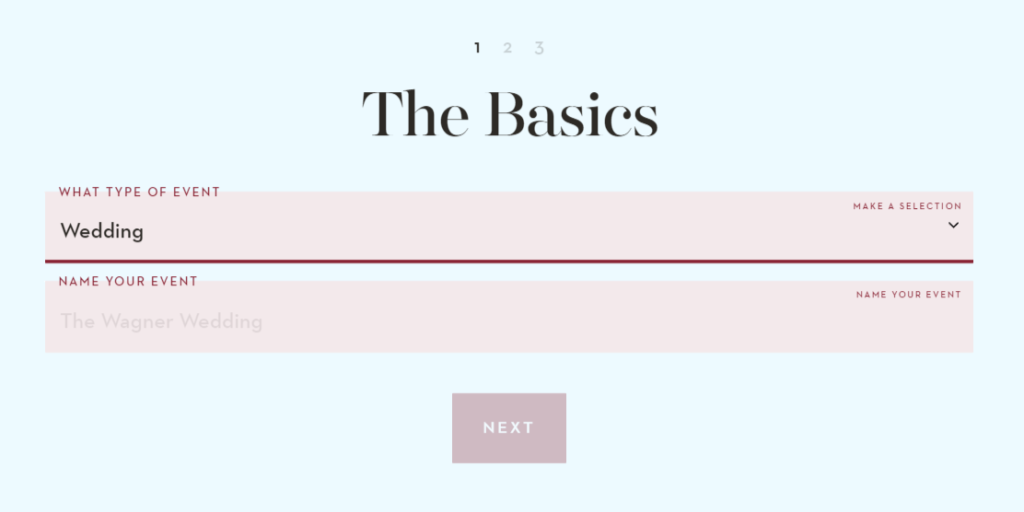
Use a clean, condensed, and easy-to-read design. Not only does a clean design save layout space, it saves the user time and effort jumping or scrolling around the page. Having a simple, clean form also prevents form fields from being missed, and gives the user less work for the same results.
Make sure the user has a quick escape option. No one likes being forced to fill in a form, so if you’re using pop-up forms, make sure you include a big ‘X’ in the corner or a noticeable “No Thanks” button at the bottom.
Make the form as short as possible. Only capture the information you absolutely need to use. You can always follow up in an email notification asking for additional concerns or questions.
Change your form types to help lazy users. Try using radio buttons instead of form fields to create a “one-click” form submission experience for passive users. The less work the person filling in the form has to do, the more likely they are to do it.
A/B test for the best results
Of course, the best way to ensure that your forms are optimized for user experience is to test them regularly. Like Joshua Porter realized during his microcopy experiment, sometimes updating and testing the smallest parts of your form can have huge impacts on conversions.
A/B testing, sometimes called split testing, will help you compare and contrast which versions of your forms and landing pages are producing more conversions.
Testing things like form placement (above the fold or after the fold?), form labels (do your form fields go next to instructions or below them?), personalized microcopy and call-to-action buttons (should you say “Sign Up” or “Join”?), and even testing your design and color schemes can help clarify areas of your form that slow users down or prevent people from filling them in.
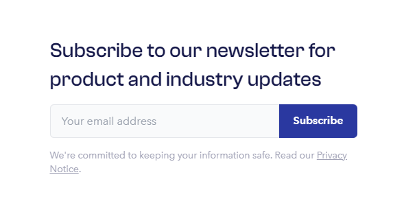
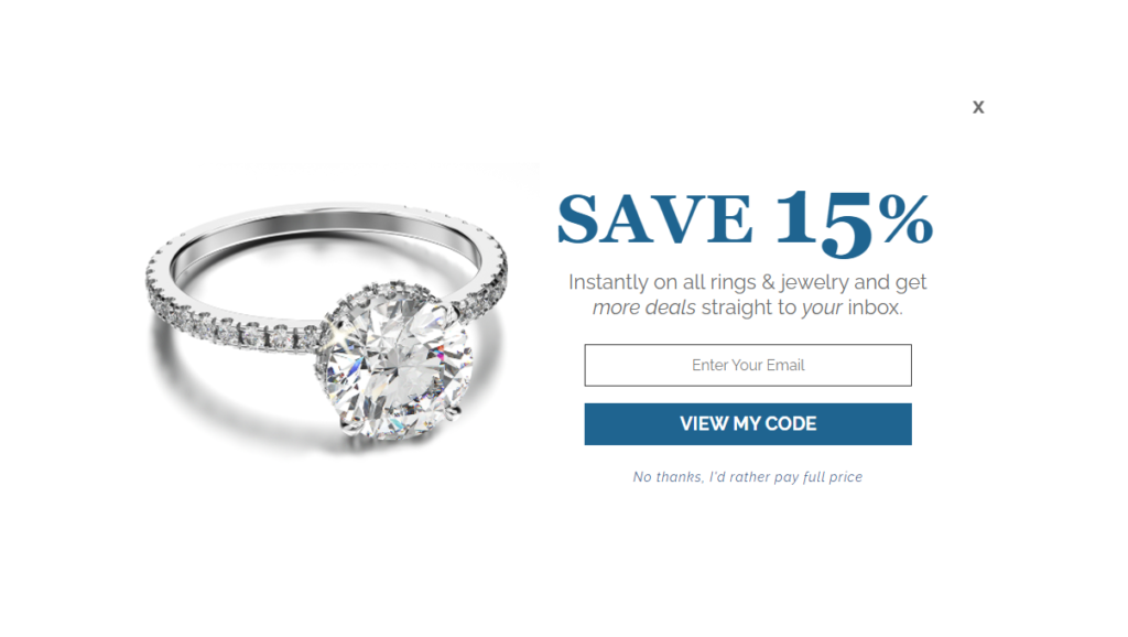
While there are no set rules when it comes to making your forms more appealing, by having great content, clean design, personalized microcopy, and frequent testing, you can ensure the best user experience possible and turn interested site visitors into actual customers.