5 Creative Ways to Use Forms to Improve Your UX
Thousands of people use web forms every day. In fact, forms play such a key role in almost every online transaction – from newsletter sign-ups to surveys, checkout processes, event registration, quote requests, and even logins to social media sites – that you’d be hard-pressed to find a website that doesn’t include a form. Even typing a question into Google is considered filling out a form, and no matter where you go online, you’re bound to run across some little text field requiring your personal information. Don’t expect that to change anytime soon.
Top research company Gartner Tech predicts that the popularity of online forms will continue to increase as the years go on, stating that by 2020 online users “will manage 85% of [transactions] without ever talking to a human.”
With the popularity of online forms comes the increasing need to stand out in the crowd, however. The more that forms are used, the more users will expect something new and different to hold their attention. The best way to get your form to stand out from the thousands of other similar forms is to create a unique user experience (UX).
A good UX is one that makes forms fun, easy, and fast to use, while also including memorable features. With that in mind, here are a few creative ways you can design your forms with an interface that will never be forgotten.
Focus on visual elements
Most forms consist of a few basic elements: title, form fields, text input fields, and submit buttons. While these elements are standard (and necessary) for collecting information, they don’t necessarily make your form stand out from the crowd. The best way to get your form noticed is to make it as visually appealing as possible.
Creating animated transitions (also known as text input effects) is a great way to pump up the visual elements of your forms and make them both fun and functional. The best way to do this is using CSS transitions and pseudo-classes. The folks over at Codrops give a few inspirational ideas for adding animated transitions to your forms.

If you don’t want to go the animated route, you can always use additional visual cues to improve UX without all the fancy CSS. Using simple elements like lines, arrows, and photos (especially photos that use eyelines to lead the user’s gaze to where you want them to look) will help draw attention to your form. Other design focus points like contrast, complementary colors, and the use of blank space will help your form get noticed in all the right ways.
Think like a mobile phone
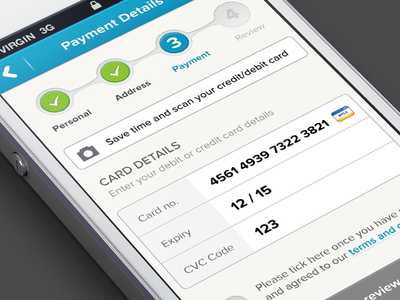
When it comes to being visually appealing (and super UX-friendly), mobile forms can’t be beat; they’re easier to use, cleaner in design, and faster than their online counterparts. In many ways the mobile form is preferable to fill out, but that doesn’t mean you should ignore your web form. In fact, you could use the same design features that make mobile forms so great to boost your web forms.
For example, try designing your web form to align vertically, like it would appear on a mobile screen (or eliminate the use of above-field labels all together and put your labels in the text fields). You don’t even need to design two forms: simply use the same number of form fields and headers you would put in your mobile form in your web form, too. The benefit of this is not only a seamless integration when it comes to branding, but it also improves your UX by making the transition from web to mobile a lot smoother.

Use single-fields for a unique UX
As Shakespeare says, “Brevity is the soul of wit.” This sentiment is also true when it comes to building forms: the simpler the better. While most contact forms are already fairly simple, you can’t get much simpler than the single-field form interface (also called the minimal form interface).
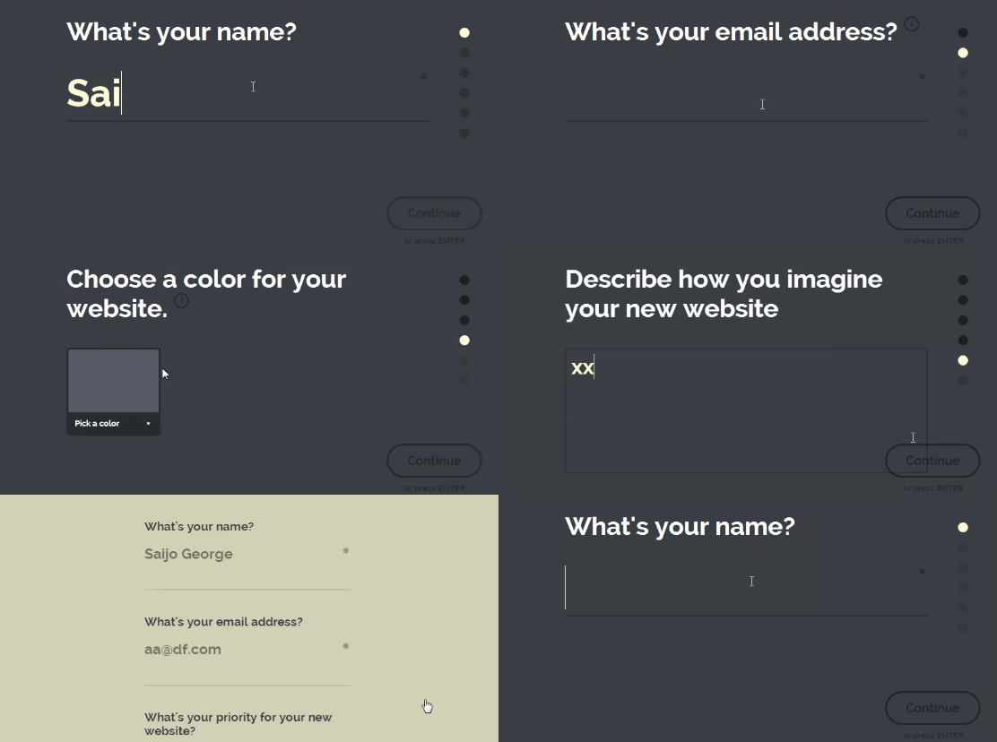
The concept is pretty straightforward: a form interface that only shows one text input field at a time, and reveals the next input field with a subtle transition. The idea is to eliminate clutter and distraction by using only elements that are helpful for the information needing to be filled in.

This form style is probably most useful for short forms, questionnaires, or contact forms, as they require much less work than longer, more complicated forms (like registration forms). Of course, simple-field forms have their disadvantages (you can’t go back and change your answers, for example), but the sheer simplicity makes it a great option as a creative alternative to the traditional form.
Try focusing attention with fullscreen
Similar to the single-field concept, the fullscreen form is another great, minimalistic option if you’re looking to experiment with your forms. Fullscreen forms aim to provide a completely distraction-free experience for users by making your form the focus of the whole page.
Fullscreen forms usually come with a few basic elements, including standard form fields, navigation dots (or numbers) that show form progress and steps, and a continue (or “next”) button that moves the form forward. The fullscreen really only displays one field (or grouping of similar fields) at a time, creating a focused experience where users can carefully review the information they’re inputting.

Fullscreen forms are especially beneficial when you require slightly more information from the user but don’t want to over-complicate your fields. The focused UX provides a visually appealing option that allows for more information while giving you all the simplicity of a single-field or traditional form.
Go “Mad Libs” with form function
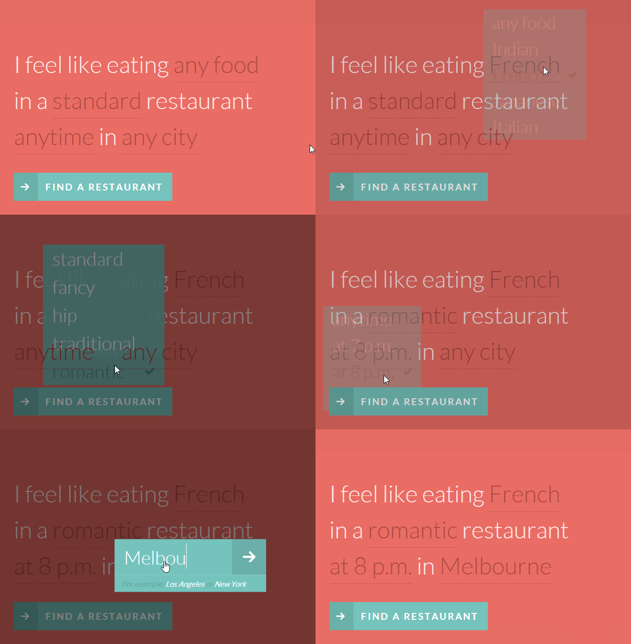
Perhaps one of the more innovative ideas when it comes to forms, the natural language user interface (NLUI) – a “Mad Libs” style form generated from pre-selected sentences and dropdown menus – is a creative deviation from tradition.
These forms take a very human approach to submitting information. Instead of the standard label-plus-input-field, they use common phrases or fill-in-the-blank style language prompts to encourage specific user input. For example, if you were attempting to find out where you users liked to vacation, you would have them complete the sentence “I feel like travelling to…” instead of answering a question like “Where do you go on vacation?”

The personalized sentence feels more relatable – like talking to a friend or trusted colleague – and less like you’re answering questions at a mandatory deposition. The benefit to UX with natural language forms is that they humanize your brand while also letting users feel excited about providing their personal information.
In terms of numbers, NLUI forms have also been shown to increase conversions. In 2014, GoodUI.org tested natural language forms on one of their sites and found that signups had increased by up to 29% compared to their standard forms. While the “Mad Libs” style NLUI form is still relatively new, it’s nevertheless an extremely creative and potentially lucrative option when it comes to changing up your form type.
Final Thoughts
Good UX relies on quickness and ease of use while also providing creative elements that make the experience fun. By incorporating features that both simplify and beautify your form, you can hold user attention and get people to actually want to fill them in. Using CSS for animation, developing humanized questions with your text fields, or eliminating text fields all together and switching to a mobile-friendly design will help move your forms from ordinary to extraordinary.