Progressive Enhancement: Start Using CSS Without Breaking Older Browsers
Once upon a time (okay, the late 90’s and early 00’s) most websites were developed using Graceful Degradation (GD) – a web design strategy that attempted to standardize the way users viewed websites from different browsers (which was a reaction to the great Browser Wars, of course).
As browser development progressed, GD allowed users with updated browsers to experience the best and brightest design elements available, while users with older browsers had a slightly “degraded” (though still functional) experience. The aim was to encourage users to continually update their browsers as newer versions came out, or to switch to more popular browsers that supported more design elements. This strategy worked well in the early days of the web, as most browsers were still relatively new and needed fewer updates to be considered “modern.”
Flash-forward a few decades, however, and things are a bit different. Most browsers go through several updates annually, and some have ceased to be updated at all (Netscape, anyone?). What this means for web developers and designers is that sites created using GD are no longer functional with today’s modern browsers.
So, why not just force everyone to use modern browsers? Not everyone who uses the Internet is able to (or even wants to) update, which means that no matter how much developers want users to be on the latest version of their site, people will continue viewing web pages without proper support. So how should developers approach web design knowing that not everyone who visits their site will be using a modern browser? They should build their sites using Progressive Enhancement.
What is Progressive Enhancement?
Progressive Enhancement (PE) is an alternate design strategy that offsets any issues caused by older browsers. Unlike GD, which is optimized for modern versions and degrades with older versions, PE starts with the old – sites are built with basic HTML elements supported by older browsers – and adds the latest bells and whistles on top of it for modern browsers. PE builds sites basic enough that any browser can handle them, but complex enough to meet contemporary design demands.
PE works by using layers of code, with the first layer being HTML. CSS is then added on top of the HTML to alter the visual and design elements as needed. Then JavaScript is added to the final layer for modern usability (the “flashy” features of Web 2.0). The layers can be adjusted to create any look and feel, while the simplistic foundation makes it viewable from any browser without major complications.
PE-Friendly CSS Tools
The best way for developers to take full advantage of PE is to use CSS tools like flexbox (flexible box layouts), filters, and blend modes in their web designs to create sites that can be viewed on any browser.
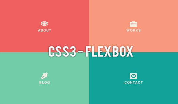
Flexbox
One of the best ways to use CSS with PE is to create layouts with flexible box, or flexbox, instead of the standard grid layout. The boxes expand items to fill any free space, making sites adaptable to a variety of display and screen sizes. This is not only extremely helpful for older browsers, but for modern portable and mobile devices.
Flexbox adds to the four basic CSS layout modes: block layout, inline layout, table layout, and positioned layout. It’s intended for laying out more complicated pages, as it allows for the position and size of certain elements to remain consistent.
With flexbox you can also create fluid layouts, specify how excess space is used, control the direction of certain elements (left-to-right, top-to-bottom, etc.) and reorder any element as needed.
It does have a few drawbacks, however. While it’s technically supported across all browsers, it does require slightly different syntax for older browsers. For example, Google Chrome still requires a “webkit” prefix, and Firefox and Safari will still need to use older syntaxes to run properly. But despite these caveats, flexbox is a great way to give websites a modern feel (think mobile-friendly) without breaking older browsers in the process.
Filters
Another great way to use CSS without causing browser issues is to use filters to add graphic effects like blurring, sharpening, or color shifting to different elements. Filters can also be used to adjust the rendering of an image, background, or border.

Why is this important? Filters can be used through CSS to add graphical changes to a site without affecting the HTML. Any browser that has a basic Scalable Vector Graphic (SVG) specification will show filters (which include almost all browsers, regardless of version). Developers at Mozilla were the first to discover how useful filters and CSS styling could be. They combined CSS and SVG working groups to make filters available for HTML as well, making it a universal tool for adding graphic effects.
Filters work best as a post-processing step after page content has been laid out. Basically, when browsers load a page, they first apply styles, then layouts, and then render the page. Filters are the final step before the page is copied to the screen. They take a snapshot of the rendered page as a bitmap image, and create pixelated graphics over the top, which gives the page a “filtered” effect (like looking through a camera with a filtered lens). Any number of filters can be used to create effects without impacting the original HTML.
Of course, there are some limitations. Filters can potentially impact loading speeds (though very minimally), and while they work across all browsers, Internet Explorer has the most trouble when it comes to applying them. IE can only apply filters to images and text, not chunks of HTML, which could cause some rendering issues with older versions. But for most browsers, filters are a great choice for adding effects without compromising the site’s structural integrity.
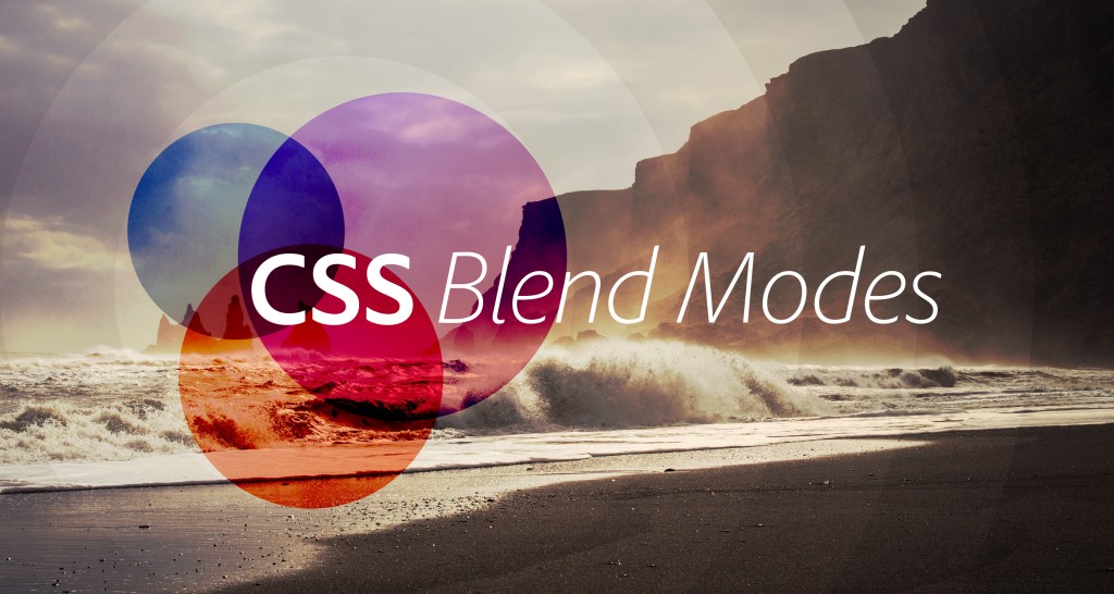
Blend Modes
Though technically considered “experimental,” blend modes are another great way to add dynamic effects to a website without causing too much trouble for browsers (though it should be noted right off the bat that they do work better with newer browsers). How do blend modes work?
Blend modes – like multiply, screen, overlay, and soft light – take layered pixels and combine them in different ways to produce a new effect (think of one picture on top of another picture, then blended together). Normally blend modes are created using Adobe Photoshop and implemented on static sites, but they can also be utilized on dynamic sites with CSS.
The most common way to do implement blend modes is with CSS Compositing and Blending, including background-blend-mode (which allows blending between background layers), mix-blend-mode (which blends elements with their backdrop), and isolation (which stops elements from blending with their backdrop). Using these modes, images can be manipulated without taxing the site’s HTML.
Getting blend modes to render smoothly across browsers is still a bit of a challenge, however, as they tend to be better supported by newer browsers. But they can still function in older browsers by using vendor prefixes or by activating experimental features. Similar to filters, IE has the least amount of support when it comes to blending modes (As of 2014, IE has them listed as “under consideration” for further support) but for the most part they can be used without too much drama across multiple browsers.
Final Thoughts
It can be a hassle to create websites that are viewable on old and new browsers alike. The best way to overcome browser issues when designing a site is to use Progressive Enhancement to layer HTML, CSS, and JavaScript to overcome any issues. By taking advantage of CSS tools like flexbox, filters, and blend modes, you can make the most of CSS without crashing older browsers. And while some tools may work better than others when it comes to browser support, they all have some advantage when creating dynamic sites that need to look good on any browser.