FormKeep's 5 Best Form Examples
Forms are essential to any website, landing page, or eCommerce store. Whether it's to contact the business running the website, completing a survey, filling out a support form, listing details on a purchase, booking a reservation, or signing up for a newsletter — every minute detail of the form’s design is crucial for accommodating your users.
You probably asked yourself, when you started out with your form, on which design layout would work best for your business, what would engage people the most and get them to fill out your form. What would be the best way to let users feel they are getting the right amount of attention and get your message across? When they make mistakes in the form-filling process, would your forms help them find their way back? Does placement matter? Would a form be more effective as a pop-up, on a footer, or a standalone landing page? What would make things easier for everyone?
From the many forms and templates out there, figuring out what to consider when designing a form can be intimidating and overwhelming. Sometimes it's best to look at forms that have worked for others. People notice right away if a form is too complicated and time-consuming— because they are many forms that aren’t.
So here we’ve collected some of the most impressive online forms from our active FormKeep clients so you can learn by example, show you what the very best forms are made of, and apply some of these effective designs to your own forms moving forward.
1. Sign-up Product Forms
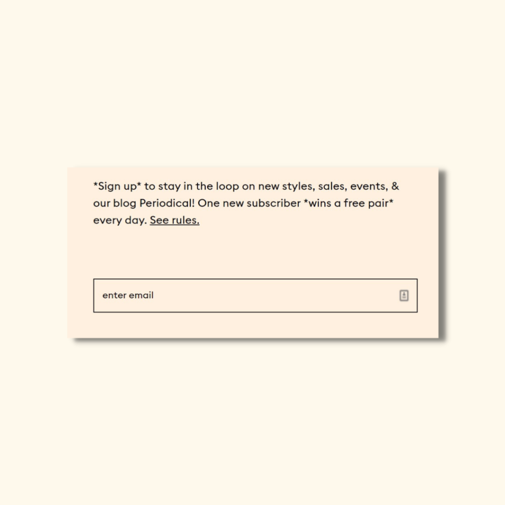
This simplistic form is found on the footer of the webpage. It's a common practice for most companies and businesses to place a form on the bottom corners of the website, as people often associate the lower area of the page with vital contact information and company details. People who often go all the way down the page are said to be your most likely candidate as a possible new user, so it's best to add a form, and provide an incentive for submitting their information — whether it's a physical or digital product, or perhaps a discount. Offer value for their effort to sign up!
2. Booking Forms
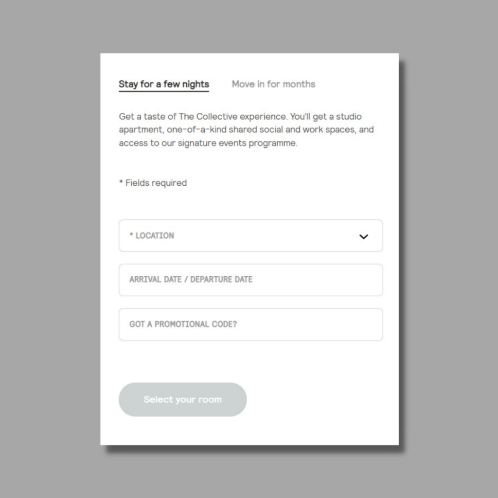
This form is found on the home page and has a seamless transition pop-up from the side after clicking a Call-to-Action to book. This sleek design is great for many reasons: it doesn't overwhelm the prospect booker to give out so many details on first glance, with concise information on what you would get out of a potential booking, and for those curious enough to get a room, this redirects to another page.
This form allows for ease of collecting information for the transaction, and helps engage interested parties to see that booking doesn't have be hard; it can be quick and easy with just a few fill out of fields.
3. Demo Forms
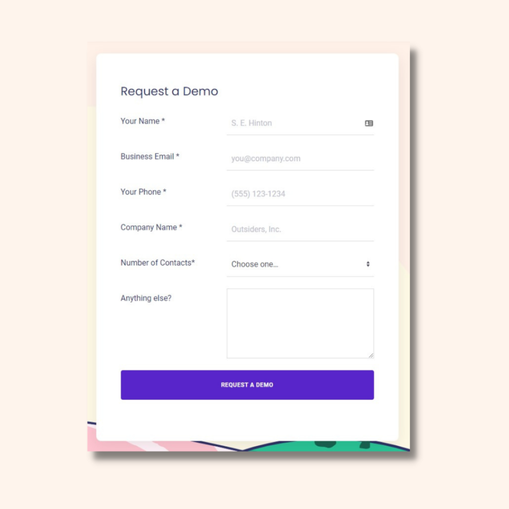
Having a dedicated “Request a Demo” landing page allows visitors and leads to try your product or service. This form is quite simple and direct, and ticks the checkboxes on the good things to find in a demo form for sales funnels: a clean and simple look, a simple straightforward form to fill, and options for their preference of contacts.
4. Brochure Download Forms
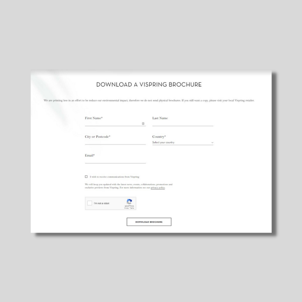
Brochures are just some of the ways you can provide value to your users, and an interesting way to collect information about the interested parties. This form is provided with its own landing page when someone shows interest in downloading a product brochure, and the compact design shows that there isn't much to fill to get what they want. Plus, with a RECAPTCHA feature, (an open feature in all of FormKeep's forms, even the free ones) this helps with the filtering of spam submissions and get the right data for your leads.
5. Application Forms
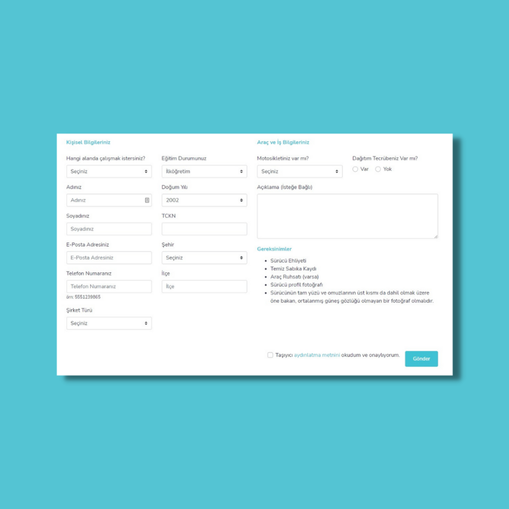
You can hire the best talent easily with online employment application forms. Not only are forms great to streamline the application process, this also helps you collect all necessary information of your applicants, learning about their skillsets, get the necessary files and gather valuable data for your own business by asking your applicants where and how they heard about you and your company. This also helps with building company records needed for one's database, keeping all the data in one place. Also, forms that allow for multi-language fields makes for a better global reach, allowing you to expand your options or perhaps look for local employees.
This form has its own dedicated page in the website, and reflects the company's colors and brand without it being too overwhelming.
The Take Away...
Thinking about the strategy of your forms and how it fits into your overall design will truly benefit the work that you do, what your company and business does, and most importantly the experience of your target market. If you’re still unsure which direction you need to take your online forms, FormKeep also provides simple form templates to help you secure your desired design that best reflects you.