How to Build Efficient E-Commerce Checkout Forms
Forms come in many shapes and sizes, from the basic lead generation form that asks for a name and an email all the way to those pesky multi-step forms that will essentially require your entire life’s history to complete.
But somewhere in the middle is the e-commerce checkout form, which is a unique animal unto itself. But what makes it so special?
Checkout Forms vs. Standard Forms
Well, for starters, checkout forms carry a bit more weight than standard forms, mainly because they need to process payments and fees. A standard form, on the other hand, is typically there to gather information, usually in the form of a name and email and not much else.
This means that checkout forms come with their own set of challenges. Some of those challenges include:
Calculating Payments
Your checkout form will undoubtedly pull a price from somewhere, and usually it’s a shopping cart. Even if your form is a simple one for processing a single payment (like downloading an e-book or a single product), there’s still payment involved, which means that your form has some calculating to do above and beyond a traditional form.
Even after calculating the price of the shopping cart items, your form will also need to calculate shipping costs (which can fluctuate based on a variety of factors) as well as any applicable taxes associated with the products. And you’ll need to make sure that you’re processing all payments through a secure gateway, which is another thing that you never have to worry about with standard forms.
Shopping Cart Abandonment
One other big factor when it comes to checkout forms is follow-through. Because most people who subscribe using standard forms are only asked for basic information, the follow-through rate is usually pretty high. But this isn’t always the case for e-commerce checkout forms. In fact, the average shopping cart abandonment rate – or the rate at which people don’t finish their purchase – is at a staggering 68%. That means 1 in 4 people will not finish using your checkout form.
The reason why people aren’t finishing their purchases is surprising: it’s about transparency. Customers often complain that they have little to no information about the purchase during the checkout process, including shipping fees and estimated delivery dates. Also on the list? Usability.
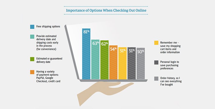
Basically, if a form isn’t upfront about the costs associated with the purchase, or the form itself is confusing and hard to use, people won’t bother filling it out. It’s those extra things that make a checkout form that much more harrowing for a designer or storeowner than a standard form could ever be.
So what’s the best way to overcome these challenges and create an efficient checkout form that customers will actually follow through on using?
Checkout Form Best Practices
To make sure that your users actually fill out your checkout forms, you’ll need to follow some best practices when designing them. Here’s a general rundown of things to include to make sure your forms are as efficient as possible.
Be Transparent
Like we said before, the number one reason people won’t use your form is a lack of transparency when it comes to prices. People want to see what’s in their cart, what their total cost will be (including shipping and handling), and when they can expect their product to arrive. Even if they’re ordering a digital download, you should still be upfront about when they can expect their download to be available.
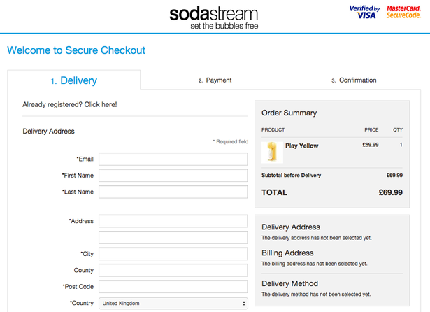
Take a page from SodaStream’s book and include as much information as possible on your form’s landing page, even if you have to use multiple steps to do it (be sure to show the summary at the final step).
Don’t Force Registration
One surprising reason why people may skip filling out your checkout form altogether is being forced to register for an account in order to purchase something. When it comes to usability, forced registration is actually a top complaint.
While accounts are a benefit to anyone ordering – they make tracking packages and reordering easier, for one – they can turn people off if they’re mandatory. The best way to handle accounts it is to give your customers the option to setup an account (or save the information they’ve already inputted) after the checkout process is complete.
Make Your Form Fields Clear
While it may seem like common sense that people would know what to input into any given field, you would be surprised how often the wrong information ends up in the wrong place. To improve usability, try to make your form fields as clear as possible by including microcopy – little pieces of text that give instruction – above or below your form fields to eliminate any doubt.
Include Fewer Fields Where Possible
The age-old adage “less is more” holds true here. Because checkout forms already ask for so much sensitive information, it’s important that you only ask for the things you absolutely need. Of course, this information will be more than a standard form because you’ll need things like shipping and billing address, but make sure that you’re only asking for information that helps verify a purchase so that users can get through it quickly.
Use Visual Cues
Because checkout forms are typically longer than lead generating forms, they will probably come in multiple steps, which can be confusing for many users, especially if your customer base skews toward the older generation. The more visual cues you can give – big, bold, colorful buttons, arrows, bullet points, or even small images – will go a long way to helping customers get through the process with minimal effort.
Use Progress Indicators for Long Forms
Speaking of multiple steps, the best thing you can possibly do for your long checkout forms is to include a progress indicator showing exactly which step the user is at in any given moment. If you’re able, you should also include a “save” feature so that customers can come back at any point in the process. Not only is this great for usability, but being able to come back to a purchase without having to do extra work is a great incentive for fulfilling purchases (and counteracting that pesky abandoned cart).
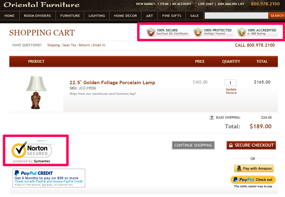
Include Trust Symbols
Finally, one of the most important things you absolutely must include in your checkout form is a symbol (or symbols) of trust. Trust symbols show that the user’s information is safe from hackers and that they can rest easy knowing that you’re not spreading their credit card information to spammers. If you skip anything else on this list, don’t let it be this!
Final Thoughts
Checkout forms may be a bit more complicated than standard lead generation forms, but that doesn’t mean they can’t be just as user friendly.
When designing or including these forms on your site, make sure to focus on elements like transparency and usability to eliminate the chance of abandoned carts.
Be sure to include only what’s necessary, and use visual elements like progress indicators, arrows, or images to guide your users through long forms.
And whatever you do, include trust symbols that show the user that their financial safety is your first priority.