How Tweaking Your Microcopy Can Instantly Double Your Conversion Rates
There’s no denying that words have power, but how often are you thinking about words when trying to improve your website’s conversion rates? Chances are, not as often as you should.
Words – in this case, copy – can have a significant impact on what happens (or doesn’t happen) on your site. (If you’re still not convinced, this video by Andrea Gardner might change your mind). But what words are the most important when it comes to generating leads?
As it turns out, it's not about big, bold headlines or catchy CTAs. It’s all about microcopy.
What is microcopy?
Microcopy is the copy that shows up in less obvious (but heavily trafficked) areas around a site – like the instructional text on forms or applications (“Please write your full name”), the words on a CTA button (“Subscribe Now!”), or the label on a form field (“Credit Card Number”). It’s often unnoticed, but it’s extremely essential to user experience.
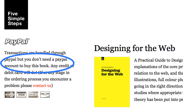
Mark Boulton, author of the book Designing for the Web, gives the perfect example of using microcopy to alleviate customer concerns. After running into issues with people trying to purchase his book, he added a small piece of microcopy to his purchasing instructions, which solved the problem. After the original copy (“Transactions are handled through PayPal”) he added, “but you don’t need a PayPal account to buy this book“. As it turns out, people weren’t buying through his site because they thought they needed to create a PayPal account. By changing his microcopy, he instantly changed his sales numbers.

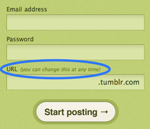
Tumblr is another great example of a company that used microcopy to improve their sign-up experience. When users are about to submit their information, they’re asked to choose a sub-domain name for their site. The microcopy next to the form field assures them that they can “change it at any time.” Who wouldn’t breath a sigh of relief knowing that whatever they enter now won’t be held against them later?

But it doesn’t stop there. Microcopy not only has the ability to improve user experience, it also has the power to make or break conversions.
How does it affect conversions?
When it comes to getting users to subscribe, little words and phrases can significantly impact whether or not people click that button.
Take Veeam, for example. They noticed on their quote request form that visitors were continually asking for a price (which couldn’t be displayed due to a privacy policy) before submitting their information. Veeam decided to change the microcopy on their submission button from “request a quote” to “request pricing” and saw a staggering 161.66% increase in clicks.
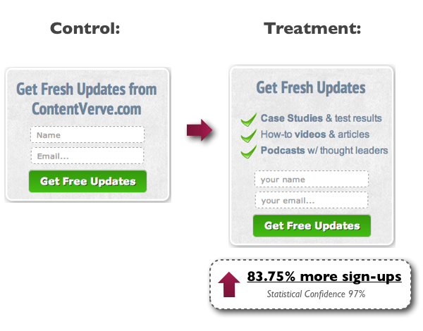
Likewise, ContentVerve saw an 83.75% increase in newsletter subscriptions simply by adding three bullet-points of microcopy under their form headline that briefly explained the benefits that visitors would receive after form submission.

So what does this all mean? Basically, good microcopy significantly improves conversions.
It should be noted, however, that bad microcopy can also negatively affect conversions. For example, student website WriteWork noticed that after changing their CTA button from the original text (“Read Full Essay Now”) to “Get Instant Access Now”, conversions actually fell by 39%. It turns out that context is just as important as the words themselves.
But the fact remains, having good microcopy on your site can help alleviate user concerns and generate more leads. But what exactly makes “good” microcopy?
How to tell the good from the bad
At its core, good microcopy is something personal – it lets users know that there are real humans behind the screen. Good microcopy uses natural language to communicate important messages.
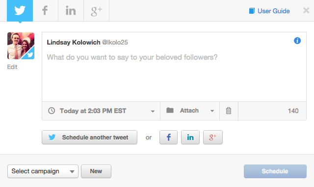
Take this prompt text from Social Inbox as an example:

Instead of simply saying that the “tweet text goes here,” it gives a much warmer set of instructions by asking, “What do you want to say to your beloved followers?”
Good microcopy also gives a sense of personality and helps users relate to your brand – it makes them feel special, like your business really knows them. Bad microcopy, on the other hand, makes people feel like they’re just another number.
Meanwhile, good microcopy helps alleviate customer concerns. Like the examples listed before, good microcopy answers questions users don’t even know they have, like whether or not they can change something later. Bad microcopy, on the other hand, means customers will have to find another way to get questions answered, which usually means you’ll be wasting time frequently answering the same questions. (You might not have to create a FAQs page, though. Simply ask yourself: “Is there somewhere I can use microcopy to answer these questions instead?”)
Bad microcopy will also demand an action (“Subscribe!”) without offering anything in return (which, let’s face it, nobody likes). Good microcopy, however, lets customers know about the benefits they can receive. If you really want people to fill out your forms, tell them what’s in it for them. While most websites use landing pages to go into more detail about the perks that come along with subscribing, you can reinforce the idea by using microcopy in important places like headlines and buttons to assure customers they’re getting the most bang for their buck.
Where to tweak your microcopy
Even though microcopy is subtle by nature, it tends to be most effective in high-traffic areas. While there are plenty of places that microcopy can be (and often is) utilized, here are a few of the most essential places on your website you should check for microcopy adjustments.
Form headlines
Headlines can include the headline on the form itself (the title that lets people know what they’re signing-up for) or the headlines on the landing page associated with the form.
Form headlines are all about conveying value and relevance to the customer – they should answer the “what’s in it for me” question. Adjusting specific aspects of the headline (like saying “Get FREE Marketing Tips!” instead of “Subscribe”) can help encourage subscribers.
CTA buttons
CTA buttons – like the “Subscribe” buttons at the end of a form – are the perfect spots to use microcopy, especially if you’re looking to double your conversion rates. A great example of this is the $300 million dollar button story, which details how one company tweaked the copy of their “Register” button and increased conversions by 45% (the company made an extra $300 million the following year).
Form fields (Instructions)
Form fields are an important part of gathering information that you need from customers, but they’re also a great place to take advantage of the power of microcopy. You can easily quell customer concerns by adding instructions that let users know what they should do.
One site owner noticed that customers were entering their addresses wrong (or so he thought) because he kept getting credit card fail messages. It turns out that customers were entering their shipping addresses, but not their billing addresses, which caused the transaction to be declined. As a quick fix, he added some microcopy: “Be sure to enter the billing address associated with your Credit Card.” Problem solved.
Final thoughts
While general copy is always important to a site’s user experience, nothing quite compares to microcopy when it comes to improving conversion rates. If you’re spending hours on your site and you’re still not seeing the subscription number you’d like, try tweaking various aspects of your microcopy, tracking your changes as you go. Test out different areas like headlines, buttons, and form fields to see if you can add text that would benefit customers and generate more leads.