How to Create a Higher Converting Form Landing Page
Landing pages are kind of like snowflakes – no two are exactly the same.
Though there are plenty of similarities between landing pages, and for good reason. There are certain strategies that simply do better for conversions, and so almost every page you see has some version of the following: a headline, explanatory text, and a call to action.
Why? Well, because these elements work.
But the exact application of each of these elements varies, with factors including things like audience, purpose, intent, angle, focus, industry, niche, and overall value.
In other words, one size doesn’t fit all. In fact, the way you blend these elements and factors together can make or break the effectiveness of your page.
Here’s what you need to know to create the most effective form landing page possible.
Dos and Don’ts for High Conversions
The average landing page conversion rate is around 2-3%, but the top 25% are converting at 5% or higher, with some reaching 10-11% or more. Here are some do’s and don’ts to follow if you want to see your numbers cross above the 5% threshold.
DO Include a Powerful Headline
It may feel cliché to include a catchy headline, but think of it as your first CTA. The headline is where everything begins – where your audience decides if they’re going to stick around or not, whether you’re interesting or boring.
But it’s not just there to grab attention, it’s there to inform. It should be short (preferably 10 words or less) and to the point, and your audience should think, “Oh wow, tell me more!” by the time they have finished reading it.
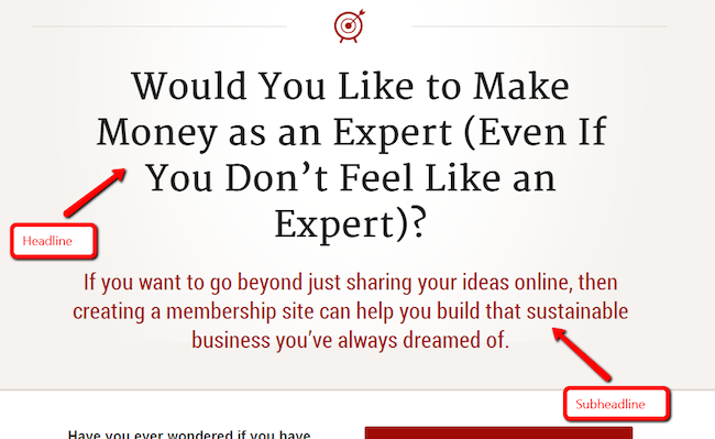
(Neil Patel over at Quicksprout has some suggestions for writing powerful headlines here.)
DO Include a Persuasive Subheadline
If the headline is your “oh wow”, your subheadline is your “let me hear more”. Your audience should be able to say, “This is why this page exists” by the time they finish reading it.
You should position your subheadline underneath the header (obviously), and it should be more persuasive than your headline copy. You can also give a little more depth and detail, as it can be longer than your headline.
DO Include Explanatory Text
It doesn’t have to be paragraphs upon paragraphs, but even something like a little extra wording to clarify the header/subhead can go a long way, especially if you get creative with the latter.
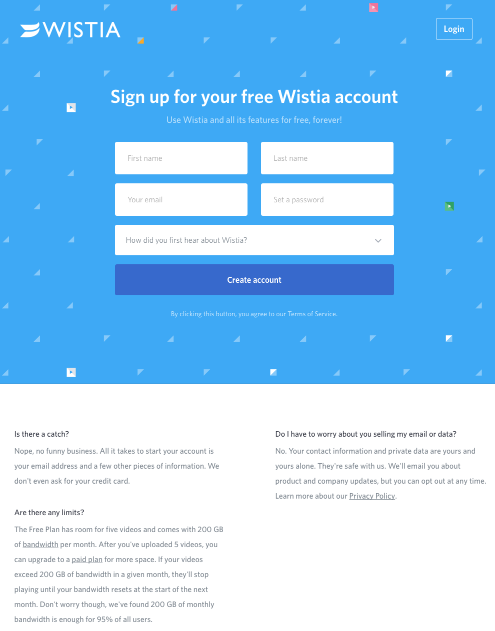
You also want to make sure that if you do include longer text, it explains the benefits that the user will receive if they fill out your form or otherwise engage with the CTA. They should be able to answer the question, “This is what I get out of the deal.”
DON’T Spend Too Much Time Explaining
That being said, you don’t have to give your audience the entire history of your company or really any more information than they absolutely need. Too much text can be visually overwhelming and make people think that your offering is more complex than it is.
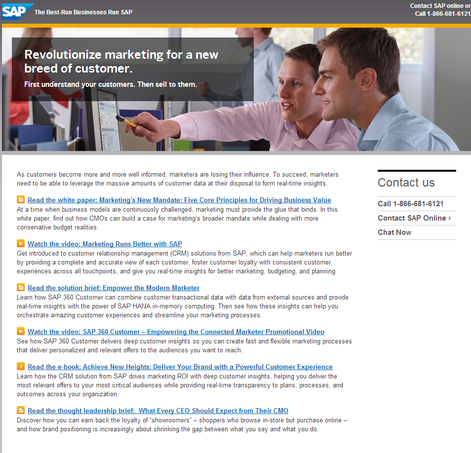
No. Don’t do this.
DO Include Large, Relevant Images
Did you know that the brain processes images 60,000 times faster than text? Now you do.
The images you use are just as important as your text, if not more so. They should be large, high quality, and relevant to your product or service. Like a headline, the primary goal of your image is to grab attention and help your audience relate to your product or service.
DO Include Visual Cues
Having a picture of a smiling person may do a good job of commutating how your customers will feel when they fill out your form and receive their product or service (or free eBook, etc.). But if you want to be more effective, use other visual cues to help users out.
Arrows are one of the most effective tools since they can easily guide an eye line to the right place (e.g. your CTA). You can make them noticeable:
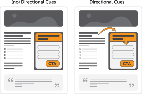
Or keep them subtle:

DON’T Forget Smaller Visual Cues
If you’re a fan of the subtle route, there are plenty of ways to incorporate tiny visual cues that can be high converting without needing to draw a big red circle around your CTA.
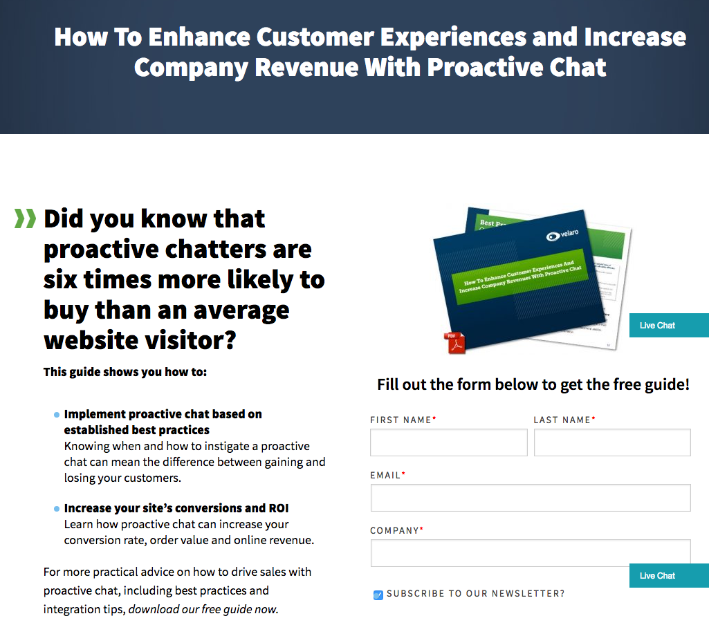
Velaro, for example, uses a small PDF symbol on their image (above their form) to signal to the user that something can be downloaded and in what format it will arrive.
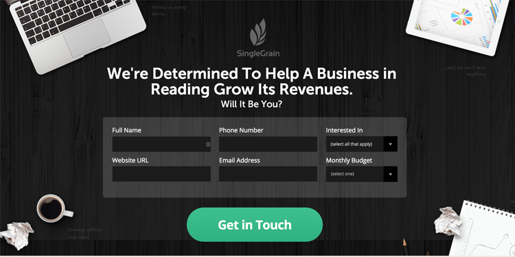
Instead of using an image of a person or scenery, Single Grain uses the elements in the background to point toward the form itself. The average user wouldn’t even give it a second thought. (They also include a small animation that makes the CTA button wiggle).
DO Include a Demo or Test Drive
Some forms are dedicated to letting users sign up for a demo of their product, but some regular forms include a demo video or a “see how it works” link on their landing pages to help users decide if they want to sign up before they absolutely need to commit.
“Try before you buy” can be helpful for new companies that don’t have significant reputation in their chosen industry.
DON’T Forget Your Value Proposition
Finally, your value proposition is the most important part of your landing page. Another word for it would be your CTA, but unlike the “submit” CTA on your form, this one comes with more of an invitation.
Your value proposition can be spread among any of the above elements. In fact, it should be in all of the elements – in your explanatory text, in your buttons, in your images, and in your headline.
By the time they scroll to the very bottom of your landing page, your audience should know exactly why they’re there, what they’re going to get, and how they can get it.
Final Thoughts
Creating a killer form is one thing, but creating a landing page that truly converts (to put that form on) is another animal entirely.
If you want to see higher conversion rates, be sure to include elements that bring the focus on the action you want the user to perform.
Use a good headline to draw them in, choose relevant images that highlight and point to your CTA, use text that explains the benefits of the form, and don’t forget to mention any additional goodies that they may get out of the deal.