"Above the Fold” Design Strategies that Turn Visitors into Customers
One thing’s for sure – we all want websites that convert. But getting random site visitors to turn into customers isn’t always an easy task. You have to balance the right amount of attraction with the right amount of useful information to keep them on your page.
That’s where site design comes into play. Eye tracking research conducted by Jakob Nielsen reveals that when visiting a new website, up to 80% or more of a user’s attention is focused at the top of the page, known as “above the fold”. What does this mean? It means your most important information should be located there if you want to improve your conversion rates.
But what exactly is “above the fold” and how can it help boost conversions? Here’s what you need to know.

What is “Above the Fold”?
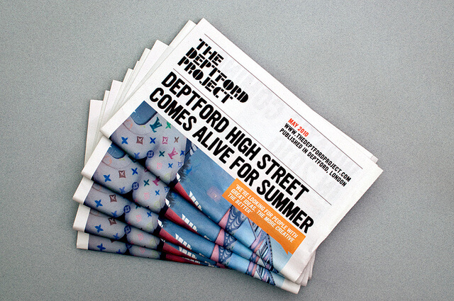
“Above the fold” is a term for any content that displays at the top of a website’s landing page. The “fold” itself originated in the world of print, when newspapers were folded in half and the most important stories, headlines, and graphics were placed above the crease line in order to grab attention.
When the Internet became the main source for major news in lieu of newspapers, the fold still remained a defining point between content that was considered compelling and content that was purely informational. Once the Internet evolved as a main source of information, however, the fold became synonymous with the content that a visitor first sees when landing on a website without having to scroll down (which, in essence, is a “digital” fold).
But websites are not newspapers, and when it comes to this digital fold the real question remains: Does above the fold still matter?
And perhaps more importantly, does above the fold design still work for conversions?
Is It Still Important for Conversions?
The answer? Kind of...
Chartbeat argues that most conversions (about 66%) actually happen below the fold instead of above it, while some designers feel that the fold concept is obsolete altogether, and may have minimal impact on conversion rates. In terms of conversions, above the fold may be technically irrelevant.
However, those same designers will still argue that first impressions are important. And since users spend a majority of their time looking at information above the fold to judge a website’s validity, above the fold design strategies are still the best way to make a great impression.
Above the fold design is about giving customers a chance to spend time on your page. Statistics show that the longer users are engaged, the higher conversion rates will ultimately be.
So while it may not have immediate impact on conversion rates, it’s still a vital component for engagement and long-term conversions.
But what should you put above the fold to entice visitors?
What to Include Above the Fold
A 2014 Google study found that advertisements placed above the fold were rated with 73% viewability (defined as 50% of the ad’s pixels being onscreen for one second) compared to only 44% viewability for ads placed below the fold.
A Nielsen Norman Group study also noted that, “What appears at the top of the page vs. what’s hidden will always influence the user experience – regardless of screen size.” The Nielsen study found that the difference between how users treat information they see above versus below the fold is 84%, meaning users will only scroll below the fold when what’s above it promises significant value.
DO give a promise of value
Above the fold design should set expectations for future content: Is what’s being offered interesting? Is it worth reading? Is it helpful?
The best way to add value is to choose design elements that grab attention:
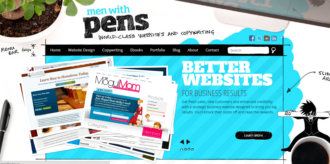
- Use images to create a happy environment that draws people in. Whether you’re selling a problem-solving solution or a vanity product, you’re also selling an experience. Choose graphics and images that reflect happiness to set the mood. The New York Times found that happiness is one of the main drivers for social media sharing.

Image source: Men With Pens. A great example of “happy” design.
- Choose headlines that offer solutions to problems (even if you’re selling a
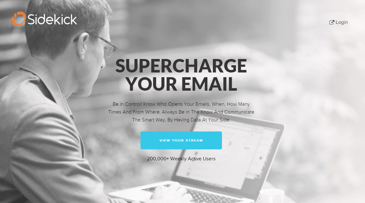
vanity item). Your graphics, images, and colors will probably be the first thing your users see when they visit your site, but your headline is what really tells them whether or not they should stay. Having headlines that address problems or pain points has been shown toincrease conversions by 32% or more. Copyblogger has a great article for crafting headlines that work. But if all else fails, stick with a “How To” headline, as they’re shown to be the most effective (e.g. “How to Cure Your Acne in Just One Week”). - Offer website differentiations that prove your credibility. Placing your website’s credentials — trust badges, social proof, etc. — above the fold is a tried and true method to increase conversions. This is especially true if you have an e-commerce website, as studies show that buyer confidence is often linked to trust. Cars.com recently boosted their conversion rate 2.7% by having a security seal on their site. Adding social proof and credibility indicators can improveconversion rates by 144.1% on landing pages.
Image source: Sidekick (now HubSpot Sales). A great example of using social proof (‘200,000+ Weekly Active Users”)

DO include a Call to Action, but ONLY IF…
While it’s important to include a Call to Action (CTA) somewhere on your website, above the fold may not actually be the best place to do it (though there’s still some debate). In the past, most CTAs have been placed above the fold to grab attention, but, as Chartbeat noted, most interaction actually happens below the fold, making above the fold CTAs essentially useless.
Oli Gardner from Unbounce echoes that sentiment: “Placing your CTA above the fold is the most common placement choice. However, this can be expecting too much of someone who has just arrived at your page.”
So does this mean that you should never include a CTA above the fold? Not necessarily. It depends on the kind of customers you’re trying to attract. You should include an above the fold CTA if…
- Your site visitors already know who you are and what you offer. It’s best to give the CTA right away in this case, as they’re visiting your page to get something accomplished, not to learn more about your product or service. Or…
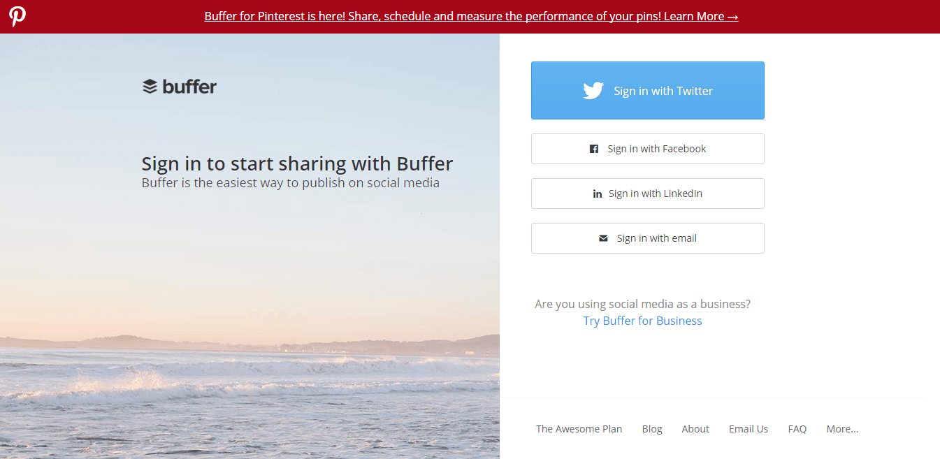
- Your site visitors are new but what you offer has immediate, noticeable value. If what you’re offering is fairly straightforward (e.g. you sell soap and only soap), then your newbie visitors would benefit from an above the fold CTA, assuming you give them some content and context. In this case, including a few sentences about your product or service along with your CTA will increase conversions.

Image source: Buffer.
However, if your customers don’t know who you are and what you do needs some additional explanation, do not put your CTA above the fold, as it may put off potential customers.
If you’re having trouble deciding whether or not to put your CTA above or below the fold, just remember that it’s all about motivation: How motivated is your visitor to click that button? If you find that your visitors may benefit from more copy related to your product or service in order to help them decide, then it’s better for your conversion rates to keep your CTA further down the page.
DON’T create a false bottom
Even if you’ve decided to keep your CTA above the fold, don’t forget to actually include something below the fold. Many websites create what’s known as a “false bottom” – a design that makes it seem as though there’s more information on the page to scroll to, but in reality has nothing else but the CTA.
If you’re really after conversions, you can’t stop at above the fold design. You have to include something that users can scroll down to, especially if your visitors are viewing your page from mobile devices. A 2015 Q2 MOVR Report revealed that 11% of mobile users start scrolling within 4 seconds when the page has finished loading. If you have nothing to show below the fold, your visitors are more likely to move on, which means fewer conversions for you.
Joanna Wiebe of Copy Hackers & Airstory says, “Don’t cram everything above the fold. Countless tests and [scroll-tracking] studies have shown that visitors are willing to scroll… as long as they know there’s something to scroll down for.”
What’s the best way to keep people scrolling? Include great content below the fold, too.
DO include great content below the fold
Ultimately, your visitors will decide quickly whether your site is of value, which is why it’s important to have a great above the fold design (you should put your most compelling content up there!). But once they begin scrolling, they’ll need more substantial information in order to take the next step (e.g. click that CTA button). If your site is nothing but above the fold design, you’ll miss out on the chance to truly convert. Be sure to include content that keeps your visitors scrolling after you attract their attention.