3 Things to Fix On Your Forms If You Want Conversions
Forms are all about action.
More specifically, they’re all about getting your users to take action. Whether it’s signing up for your newsletter or downloading your latest white paper, you want to get your users to do something – that’s called a conversion.
But conversions don’t happen by accident. The way you design and program your form plays a major role in how many people follow through with filling it out.
Unfortunately, there are a few areas that most designers or developers overlook when creating their forms, and it’s costing conversions.
Here are three key areas you need to fix on your forms if you want to keep your conversion rates high.
Error Messages
Error handling is typically one of the last things a developer will do when putting together a form, which often means that it’s the one process that gets the least amount of attention.
But a form that doesn’t tell you exactly what went wrong when an error occurs or leads you to a 404 page – or, heaven forbid, somewhere else entirely – is not just annoying, it’s a signal to your users to never come back and finish that form.
Suddenly your conversions drop and you’re not sure why.
While the first and most obvious step is to prevent errors wherever possible – and ideally they don’t happen because of a design flaw – it’s still important to have a great error handling system in place should errors occur.
Here are a few things to keep in mind when working on your error handling:
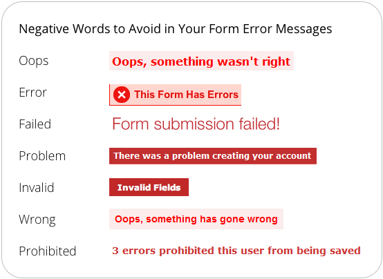
Avoid negative words. While errors are bad, you don’t want the wording to elicit feelings of fear or make them feel that the situation is worse than it is. UX Movement has a great article on making your form error message more reassuring here.
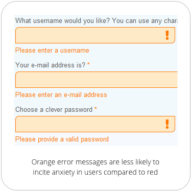
Avoid using the color red. Instead, highlight error fields in orange or yellow. Similar to the above, the color red – while prominent – can make the user feel like they’ve made a grave mistake. Red tends to be associated with danger, so while you still want your error to stand out, it’s important to signal to users that the error is fixable and that they have nothing to worry about.
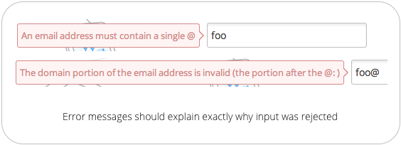
Specify why the field information wasn’t accepted. Just having a note at the top of your form that says “there was an error” isn’t enough to keep people from panicking. Your error message should tell users exactly which information was rejected and why. For example, an email field should tell users to include the ‘@’ symbol or remind them to double check the spelling of their domain. The more specific you can be, the better.
Visual Cues
The next big area you may be overlooking is the use of visual cues.
Many forms come on solitary landing pages, which makes the forms themselves easy enough to find and is one way of getting people to fill out your forms, but that doesn’t always mean conversions will automatically happen.
In fact, whether or not your form is easy to spot on your page, you should include visual cues to direct users there anyway.
Directional cues are signals that tell someone to complete an action, and remember, forms are all about taking action. Cues can include photos, shapes, videos or text, but how and where you use them can significantly impact conversions.
Here are some things to keep in mind when it comes to drawing your visitors to your form:
Use an image of a person looking at your form. Humans are social creatures by nature, and so they tend to be drawn to what others are looking at. You can use this human trait to your advantage by having your images direct people to fill out your forms.
Have a person or group of people looking at your forms with their eyes, pointing to your form with their hands, or even holding your form.

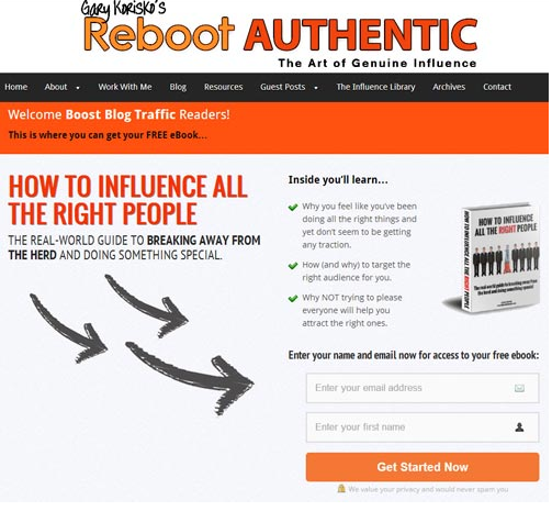
Use arrows. Symbols and shapes drive much of our visuals in modern advertising, and the arrow is the king of the symbols when it comes to directing users to take action. Nothing says “look here” quite like it.
Reboot Authentic, for example, uses three arrows to direct visitors to their lead-capture form:
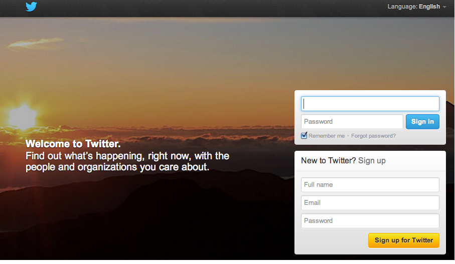
Limit objects in the same visual view as your form. Minimizing the noise around your form will certainly draw the most attention to it, but that doesn’t mean you need to create a whole separate landing page for each form. You can also use colors to visually direct users to your forms, or make use of blank space to create a contrast that stands out.
Twitter does a fantastic job of this on their signup page:
Button Language
Of course, it could be argued that you should never rely on design alone to communicate.
After all, 8% of men and 0.5% of women have a colour vision deficiency. Another 39 million are blind and 246 have low vision. Communicating with visual-only cues just won’t catch everyone.
While pictures and arrows may help people find your form, the “Submit” button does most of the heavy lifting. That’s where your button copy comes into play.
Buttons will tell users to “Get a quote,” “Download,” “Open an account,” or even “Go to checkout.” But whether someone submits your button depends on the quality of the text itself.
Here are a few things to keep in mind when selecting the right copy for your buttons:
The copy should begin with a verb. Otherwise it’s not really a call-to-action, just a button with some text on it. “More information” for example, is not a call-to-action.
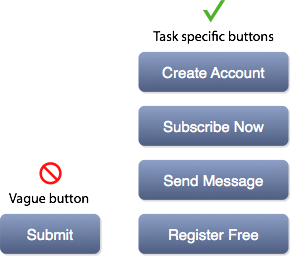
The language should fit the context. If you’re signing up for banking online, for example, you’re going to expect words like “Register” or “Apply”. If you’re signing up for an e-commerce site, you look for “Sign up” or “Go to Cart”.
It’s also important for the language to be personal wherever possible. If the overall context of your site is friendly, using text like “Sign me up” instead of “sign up” can also improve your conversions.
Think about what your user would say. Imagine that you asked your user what he or she was trying to do. If they would say, “I want to sign up,” then you would use text like, “Sign up.” If you were asking the user “Would you like to…?” then the text would sound more like, “Sign me up.” These are what Jared Spool calls “trigger” words.
For any button text, ask yourself if it fits with the statement "Would you like to?” or “I would like to". The question: “Would you like to sign me up?” doesn’t match with: “I would like to sign me up”.
Final Thoughts
When it comes to improving conversions on your forms, there are really three key areas you need to watch out for: error messages, visual cues, and button copy.
If your users aren’t taking any action, then you want to use visual cues to direct them.
If they’re not sure if they want to submit the form they’ve just filled out, then use your copy to elicit an action.
And if they have taken the wrong action, gently nudge them in the right direction.