Designing Forms that Convert
A huge part of the success or failure of an online business depends on its forms and their ability to convert viewers into paying customers. Contact forms must gather essential information on leads, and checkout forms must endear enough trust for users to hand over their credit card details.
Designing forms is an art. There are many subtle elements: your forms must be brief yet exhaustive, noticeable yet non-intrusive, unambiguous yet not trivial, minimal yet interesting. Web forms should be about the user experience above all else - but they must also provide you with the data you need to run your business.
Luckily, there’s a lot of simple things you can do to increase your conversion rates without sacrificing data quality.
Reduce form length
Many companies have massively increased conversion rates by just removing a few unnecessary fields from their form. Expedia, for example, eliminated one field (company name), and gained $12 million/year in profit. Imaginary Landscape compacted their form from 11 fields down to 4 and found a 120% increase in conversions. Even better - the field they removed had no real impact on the quality of leads generated.
Don’t ask for phone numbers
Almost every contact form involves asking for an email address, but some forms ask for a phone number as well. Including a phone number field decreases your conversion rates by about 5%. For businesses that rely on post-click sales calls, this may be a worthy trade. But for most, it’s better to leave it out, or at least make it optional. In one study by Luke Wroblewski, making a phone field optional led to a 37% drop-off on the phone number field entries, but doubled the conversion rate of the whole form.
Show the password
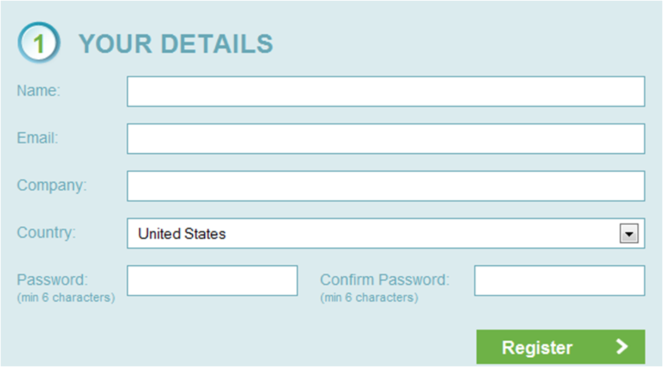
By default, any password field in a form masks all the characters with asterisks. But like Reset buttons on forms, this seems to be one of those 20-year-old decisions that have become “just the way things are done”. Password masking then led to people making mistakes when entering their password and not being able to log in, which created the “Confirm Password” field that everyone loves.
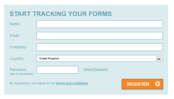
But if we just take a step back and reconsider whether that 20-year-old design decision is still serving us well, maybe we can remove another form field! Many companies like MailChimp and Amazon are now presenting a single password field, along with a checkbox to show the password as plain text. In one A/B test, Formisimo found that replacing the Confirm Password field with a Show Password checkbox increased conversions by 56% and decreased the number of corrections made (from mis-typing or second-guessing) by 24%. Interestingly though, it had no effect on the password reset request rate.


Use the right inputs
When you’re deciding which form fields to keep and which to throw out, keep in mind that not all fields are equal. The cost of keeping or adding a field depends on what type of field you’re adding. One extra text input field won’t do much to your conversion rates - just a $12 million/year loss . Adding one text box can drop your rates by almost 10%. It makes sense: most single-line text input fields don’t involve any creativity or decision-making. It doesn’t require effort for a user to recall their name or email address. A radio button is slightly more difficult, but at least all the possible answers are pre-defined. But a text area means that the user has to get creative and come up with a response on the spot - usually a complex message or comment. If you must include a text box, think about marking it optional.
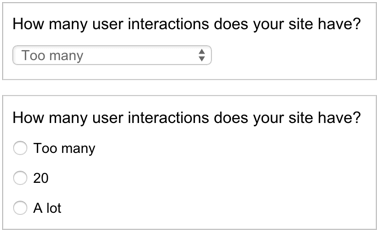
Dropdown boxes aren’t as bad as text boxes, but they’re still significantly worse than single-line input fields. If your dropdown box only has a few options (5 or less), try replacing it with radio buttons. Radio buttons are faster to interact with because they allow the user to see the answers before they click on the input.

Real Time Validation
If you’re only validating upon form submission (or worse, not at all), you’re missing out on a really easy conversion rate boost. Luke Wroblewski ran a few studies and found that real-time validation increased conversion rates by 22%, decreased errors by 22% and decreased completion time by 42%.
Focus on your Call to Action
Ok, so now you’ve optimized the hell out of your form fields. What else can we do to increase conversion rates? Let’s look at the Call to Action (CTA). Minor changes to your CTA can make a surprisingly big difference on conversion rates.
The first thing to look at is the color and position of the CTA. You may have heard of HubSpot’s study - they ran an A/B test on one of their client’s websites, and simply changing the CTA’s color from green to red improved conversion rates by 21%. So does this mean that you should immediately go out and change all your green buttons to red? Not necessarily. Take a look at the website HubSpot was testing:

The logo is green, the icons are green, the screenshot is green - so of course the red button stands out a lot more than the green button. Take a look at the following design - which of these buttons do you think will convert better?

So the lesson to take out of this is not “make all your CTA buttons red”, but “make sure your CTA buttons contrast well against the rest of your site”.
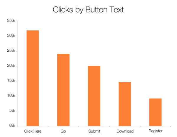
Once that’s handled, take a look at your CTA copy. It may seem that as long as it’s clear which button is the “Submit” button, and it says something like “Submit,” you can’t go wrong. In fact, Dan Zarella found that “Submit” is one of the worst words to use for your CTA. Take a look at the graph below: “Click Here” performed almost twice as well as “Submit,” and more than three times better than “Register.”

But don’t go rushing off to change your CTA buttons to “Click Here” just yet - think about how to best apply this to your design. Optimizely increased their conversion rates 27% by changing their CTA text from “Get Started” to “Test It Out.” They concluded that “this language made it more clear that the user could try it immediately without a long process. We thought "Get Started" presented a more hands-on, involved process.” Taking another look at the above graph, this makes sense. “Click Here” involves absolutely no commitment - it’s purely a directive. “Register” on the other hand, sounds like going to the DMV and spending three hours in line.
A/B Testing
Before you make any modifications to your forms, use an A/B testing setup to compare your conversion rates before and after. Maybe you’ll be able to add in a new input field without sacrificing conversion rates. Perhaps you’ll finally get an objective answer on what text to place in your CTA button. With time, iteration and solid data, you’ll be able to increase form conversion rates and boost your client base.