
Contact forms are the bread and butter of any business’ website. They’re how you gather new leads, convert prospects into real customers, and support your existing ones. They should be one of the places you focus on most when designing your website: A/B testing different solutions, getting creative with layouts, and optimizing conversion rate.
Unfortunately, most contact forms are the last priority when designing a website. They not only end up looking rushed or out of place within the context of the site’s design, but identical to every other site. The contact form is the end of the user’s journey through your website, and should be one of the key areas that differentiates you from your competition. It can be a real waste when your website uses beautiful fonts, colors and graphics like this: And then your contact form looks like this:
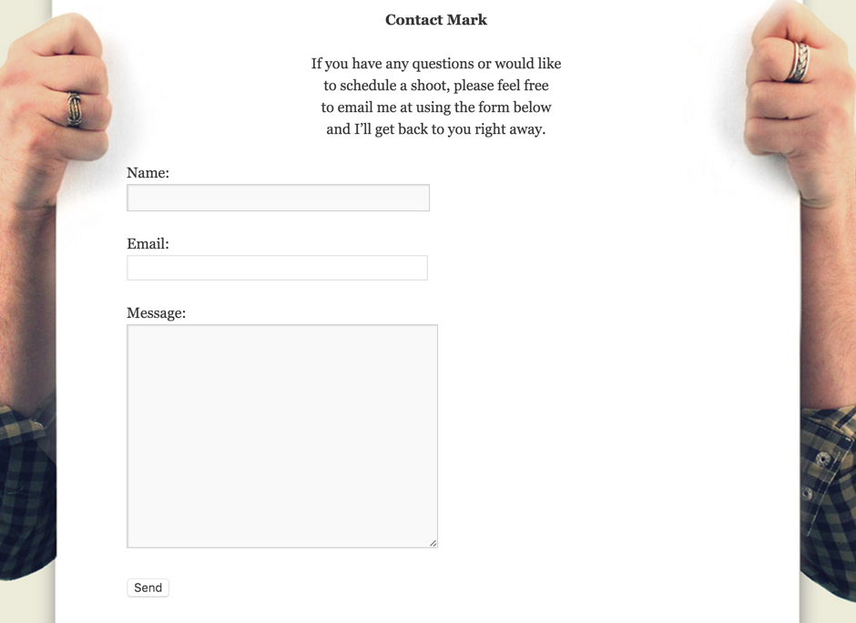
It can be difficult to come up with ways to get creative with your contact form. Most contact forms only need three pieces of information: the user’s name, a way to contact them, and a short message. The easiest way to do that is by simply using three text fields and a submit button. But getting creative with your contact form can improve the quality of your leads, increase your conversion rate, and bolster your brand’s reputation for good design.
Provide Options
The default contact form is great, but not always the most suitable. They’re not great for receiving immediate help, or for complicated requests. By providing different options at this point, users can pick what suits them best. Here, Chargebee offers not only the default contact form, but also a call back request. Placing links to the company’s social networks here would also be a good idea (Twitter and Facebook are great ways for getting in touch with a company).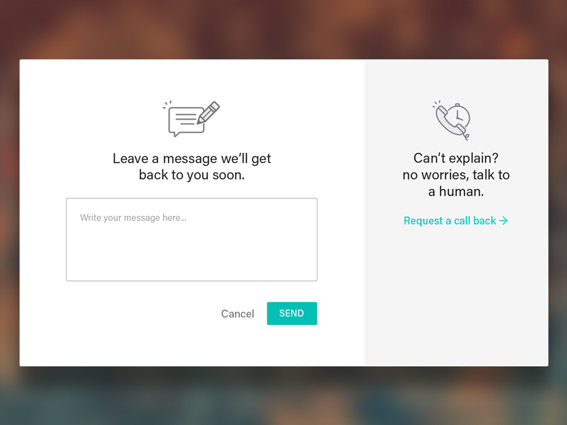
Fit the Design
A beautifully-designed website will impress visitors and sell your business. But since your website is essentially a path leading towards your contact form, having this final point in the journey be comparatively disappointing will tell visitors that you don’t pay attention to details. If you can’t get such an important aspect of your own site right, how can they entrust you with their site?
You don’t have to go to extreme lengths to create an entirely new contact experience – simply taking the time to design the form around the rest of your site is a great first step. Saus, a creative communications studio, has styled their contact form based on a physical postcard. At its base, it’s still just a couple of text input fields and a submit button, but it fits perfectly into the context of the website.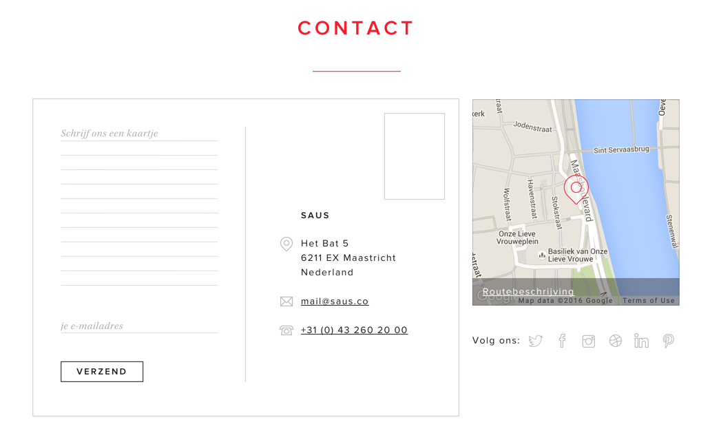
Give Context
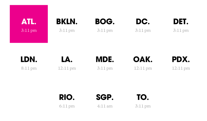
One way to improve Saus’ form would be to give the user some expectation of when they might receive an answer. If they call immediately, will there be someone to answer? If they email, will it be minutes, hours or days until they receive a response? Huge does this well by appending the current time to each of their offices. Now the user can tell whether or not it’s currently business hours, and can get a rough estimation of how long a response might take. If it’s currently 2 AM, you won’t be getting a response until later in the morning. But if it’s 2 PM, you can probably expect one within the hour.
Give a Head Start
One big discouraging influence in many contact forms is the blank text field. Name and email address are no problem – the user already knows those, it’s just a matter of being willing to share the information. But a big blank text field saying “Message” is daunting. The user needs to figure out exactly what needs to be shared, and worry about what they might have forgotten to include. A great solution to this problem is a mad-libs style contact form, like the one below from Andrew Haglund.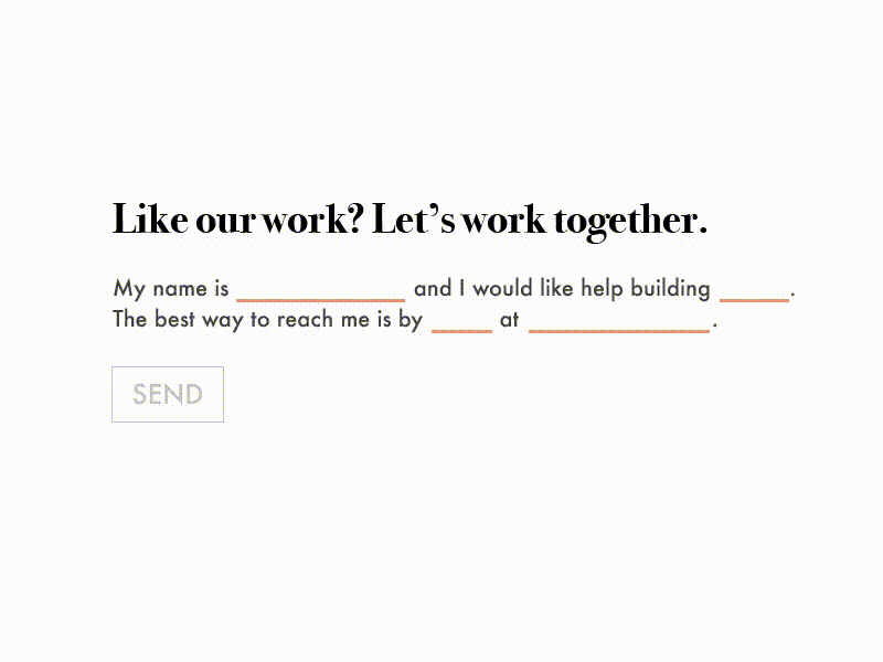
Eliminate The Blank Page
Even if you don’t want to go full mad-libs style, there are still ways to avoid the blank page syndrome. Prime users with multiple choice questions and quizzes, then use placeholder text to further guide their answers.
Break It Up
Some contact forms won’t fit into the simple name-email-message structure, and will need to request a bit more information from the user. Placing a lot of text fields on screen at once is a sure way to scare users off, especially those with limited time. By breaking up long contact forms into sections, the form appears smaller and gives the illusion of taking a shorter time to fill out. Creative Digital Agency Harbr breaks their con
tact form into three steps. The final step is still a freeform text input field, but by this point the main questions have been answered, and this field is more of a support, rather than the critical piece.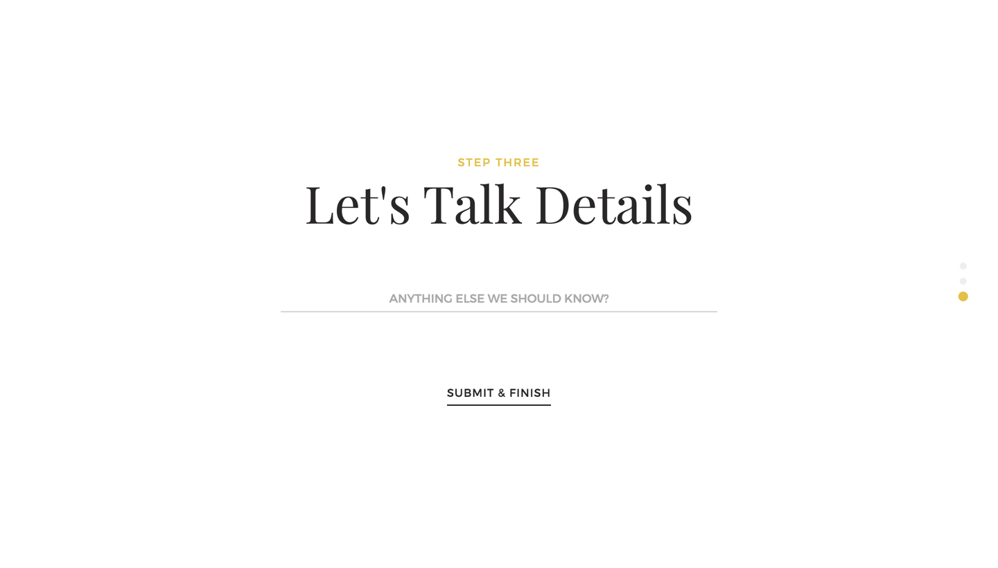
Get Graphical
Most form elements are pretty boring by default. Typeform spices up their designs by using simple illustrations instead of radio buttons. The illustrations remove the reliance on detailed copy, and allow users to skim the form. The less reading involved in your form, the faster users can fill it out, and the higher your conversion rate will be.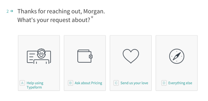
Be Analytical
Whenever you’re making changes to your contact forms, make sure you track and analyze how the form performs before and after. If the changes you make reduce interaction rates, that’s not necessarily a bad thing! You might be reducing the rate of users asking questions that your website already answers. Keep track of how many useful conversions you get, and use the data to guide your design decisions.